The Top 9 Web Design Trends to Watch Out for in 2022
Not every trend is worthwhile to follow. Keep reading to find out which web trends the ‘best web design company in India’ incorporated to delight and engage their online visitors. Although not all design trends are new, they are all popular for good reason: it increases the number of visitors.
9 web design trends to watch in 2022
1. Memphis Design:
Memphis Design is a design approach from the 1980s that is defined by a scattering of vividly colored forms and lines. Circles and triangles are often combined with black-and-white graphic motifs such as polka dots and squiggly lines. This perspective is particularly relevant now when minimalistic techniques have resulted in a swarm of interfaces that are overly homogenous (yet understandable).
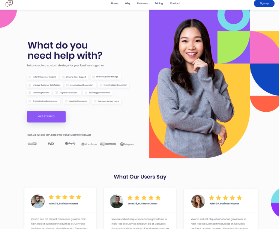
By: Aneley
It’s no surprise that most web design agencies in India are turning to Memphis design for a burst of vibrant personality that no visitor will quickly forget.
2. Hero Image:
A hero image is a website design phrase that refers to a large banner picture that appears at the top of a website. Because of its prominent location near the top of a homepage that normally stretches full-width, it is often referred to as a “hero header,” and it serves as a user’s initial view of your organization and service.
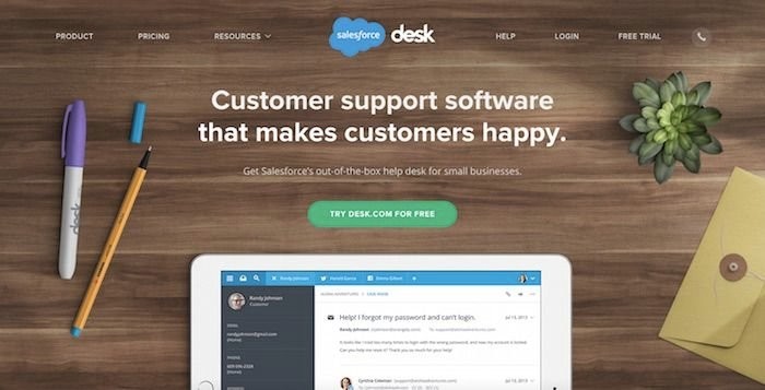
By: Optimizely
A hero picture might include your company’s USP and a conversion objective, such as a registration form or a button to start purchasing, in addition to a high-resolution graphic. Instead of static photographs, a recent web design trend has been to incorporate films and animations for the hero image.
3. Typographic Hero Image:
The web designers of 2022 are taking the craze to a whole new level by using typography-led hero graphics. Essentially, the artwork in these hero parts is reduced or removed entirely, allowing the words to bear the weight of the initial impression.
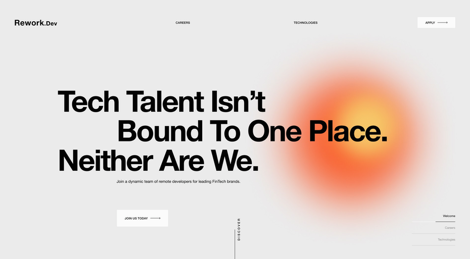
By: Bluesjay
These hero portions are striking in their simplicity rather than seeming naked. They attract attention in the same way that a compelling news headline does. They also give a fantastic display for some stylish, innovative lettering styles along the route.
4. Innovative scrolling experiences:
Scrolling is the most prevalent sort of user interaction with a website, and scrolling provides a continual chance for dynamic interactive feedback.
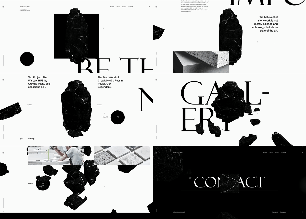
By: stonestyle.co.th
In 2022, visitors will be guided on imaginative excursions via scrolling interactions that will be grander than before. The key to capitalizing on this trend is to amaze visitors with a distinctive experience.
Psychedelic images, parallax effects, and even forays into the third dimension will transform pages into living worlds. As these animations get more intricate and colorful, many web design company India, are integrating a strong foreground element for the visitor to focus on, such as Stone & Style’s dark crystal.
While an engaging animation tempts visitors to scroll to the end of the page, the foreground mark stops them from getting lost along the way.
5. Animations and Interactive Web Design:
In recent years, motion design and interactive web design have grown highly popular. To provide a really unique user experience, more and more websites are including various forms of animations, movies, and 3D objects.
The speed of browsers has improved, and web technologies have advanced dramatically. This, together with the long-awaited introduction of 5G internet, enables website owners to stay up with current trends without sacrificing page speed.
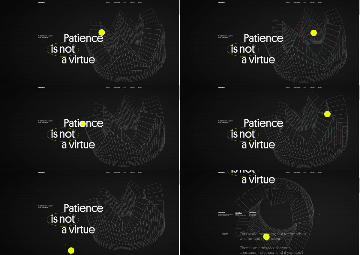
By: weareimpero.com
These engagements go beyond scrolling to promote more active engagements with the page such as dragging animated elements. This results in unique experiences that make visitors feel more like detectives, probing and prodding the website to discover its secrets.
6. Off-Screen Elements:
Oftentimes it’s what you can’t see that makes a design intriguing.
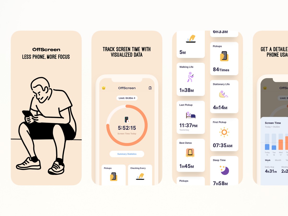
By: Allen Wang via Dribble
Moving images, text, and other items that seem to move straight off the screen are used in the trend of the off-screen elements. The motion may happen on its own or as a consequence of activities like hovering or scrolling.
What’s fantastic about this trend is that it invites website users to take a closer look at the design and consider what they’re seeing and how it relates to them. On the other hand, if there is too much going on, the message may be lost. As a result, this trend works best with straightforward, easy-to-understand pieces.
7. Visible Borders:
Human psychology has set down their fascination with designs that contain a delicate alignment of information inside the lines. In 2022, designers will place a greater emphasis on real-world designs and user experiences. Any website’s impermanent basis is defined by boundaries, borders, formats, and grids.
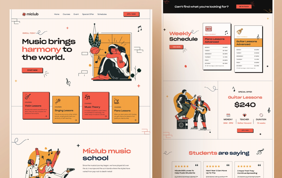
By: Logogram
For the user to scan various portions, a clear border is seen and desirable. These 90s designs restore the frame’s classic and vintage style, making it more sophisticated than before. Designers may communicate their stories in much more concentrated and easy ways using such designs.
8. Micro Interactions:
Micro-interactions are little animations that produce motion when users engage with them on a website or app. You’ve probably seen the link hovers effects and color changes. Micro-interactions work on the same principle as micro-interactions, but they induce motion sensations when users interact with the site’s elements.

A website may profit from micro-interactions in a variety of ways. It improves the entire user experience by improving website navigation, encouraging users to interact with the content on the site, displaying information about items, encouraging users to share the content, and adding an emotional touch.
Micro-interactions are also employed in iPhone and Android app design, in addition to web pages. Micro-interactions will continue to be popular this year and in the future.
9. Neumorphism UI Design:
Neumorphism User Interface Design is a hybrid of skeuomorphism (GUI design to depict interface objects that resemble real-world equivalents) and content design.
The latest website design trends are being used by a large number of sites nowadays to give buttons and other components a 3D feel.
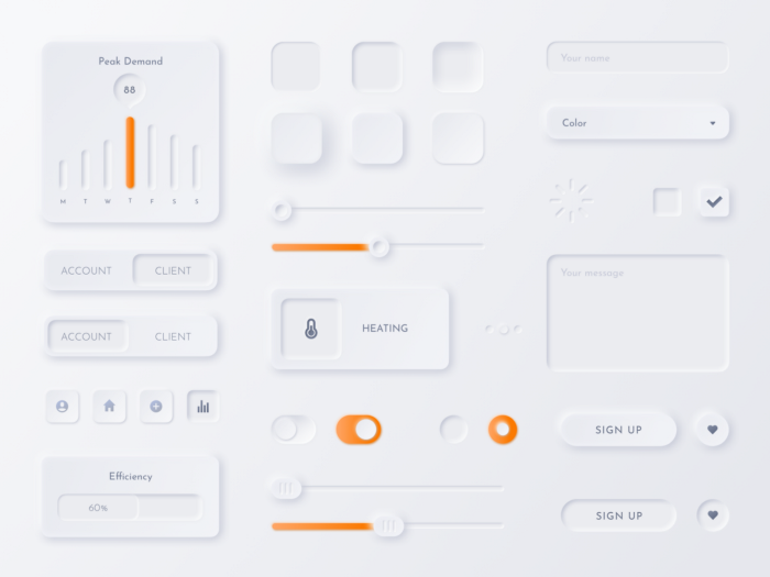
By: Samson Vowles from Dribble
It gives the viewers an out-of-the-box experience with a distinctive and impactful design and sensation. Neumorphism also increases the site’s content usability and accessibility.
Wrapping Up:
This year’s designers of the best web design company in India are more likely to develop compelling online designs while keeping accessibility and easy navigation in mind.
In consideration of it, we’ve discussed some of the most innovative and out-of-the-box Web design trends for 2022. It is critical to keep up with these new web design trends in order to remain competitive and relevant in the internet world. It not only enhances the user experience but also matches rising needs and expectations.
The current web design trends that will be used by a large number of websites in 2022 include Memphis Design, Animations and Interactive Web Design, elements, Visible Borders, neumorphism UI, Typographic Hero Image, and simplicity.
If you are looking for a professional web design agency in India, then you should contact DreamSoft Infotech now.


